5 top website design trends 2020
Is your website ahead of the curve? Or does it in desperate need of a contemporary update? If your organisation’s website is in want of an on-trend design spruce, read on.
With endless technical advancements in the world of website design, web design trends are continually changing and evoloving. Some trends that are less fleeting and more enduring than others. It can be hard to stay relevant when website design can often date really quickly. Websites that do not keep up with the times look dated, uninspiring and unloved. That’s why it’s important to keep on top of any website developments in order to stay relevant to your audience.
Exploring the top web design trends
In this blog, we list five website design trends to consider for any planned updates or website redesigns you may have this coming year.
Although online design aesthetics can be subjective and mostly linked to your specific target audience, use these website design trends below as a guide to help influence your overall digital marketing strategy.
1. Visually led content
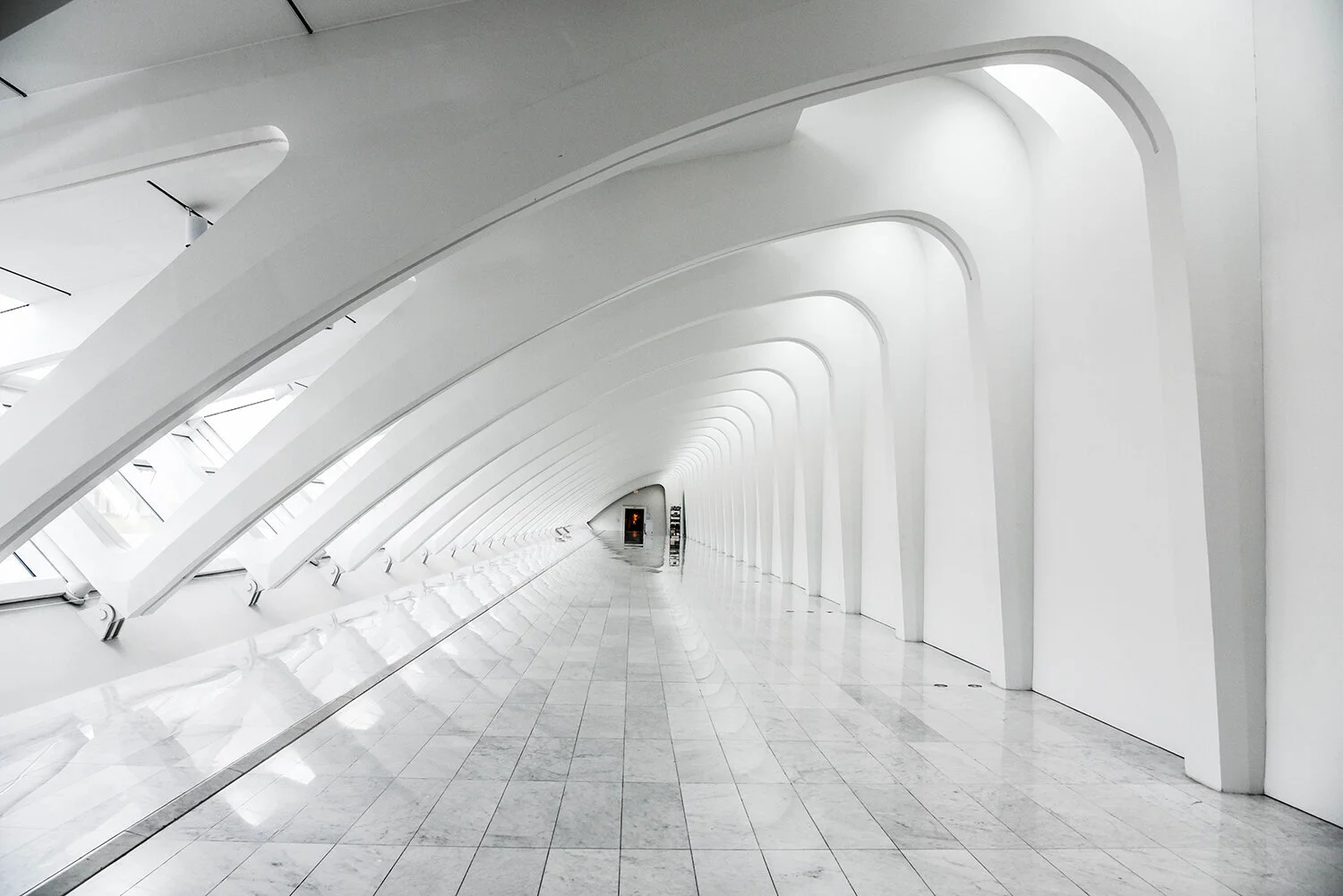
This is a website trend which isn’t likely to disappear. It re-emerges stronger each year. The use of videos and ‘loopable’ background clips that automatically play once users land on your homepage is an appealing way to engage new and returning audiences.
It creates a great opportunity for you to showcase your work and communicate your values and aesthetic faster. US-based architectural practice, Trahan Architects draw users to become an active part of their website experience by featuring short clips of their projects which are triggered to play when users roll their cursors over a still image. This is one example of visual-led content done well.
This type of interactivity engages users and enables the content to stand out more so than just text on its own. If incorporating this trend, above all, make sure your website is equipped to load at speed.
2. Attention grabbing graphics
Going a step further than video, is the growing use of illustrations and attention-grabbing graphics on websites such as this example from Studio Weave’s homepage.
Although not a stranger to the industry of architecture and design, detailed illustrations and graphics have been given a new lease of life on websites, transforming the way practices communicate their ideas, visions and values.
Check out urban design and public-realm practice Publica’s Year in Review. Full of personality, Publica combine the use of bold graphics and the scroll feature to keep users engaged. Another vibrant example is design studio make:good’s use of website graphics that extend to their social media channels. Could graphics and punchy illustrations suit your brand aesthetic?
3. Mobile-first design approach
Back in 2016, mobile usage was reported to have surpassed desktop usage. Furthermore, according to industry-specific research featured on Archiboo’s website white paper from 2019, “an average 20% of visitors to architects’ websites are mobile based. This is compared to 8% in 2016, 12% in 2017 and 15% in 2018”.
With this growing figure, optimising your website for mobile is becoming more and more evident. Good news- if your website displays well on a mobile device then it will translate better on all devices.
4. ‘Dark mode’ vs ‘Light mode’
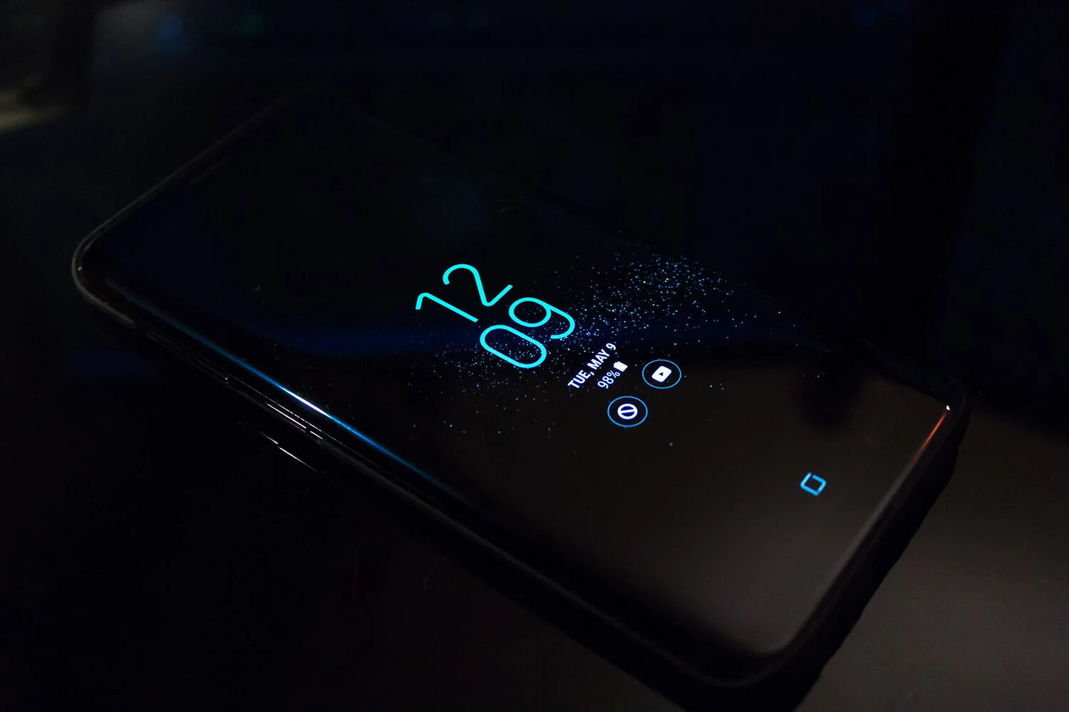
2019 saw hype around the introduction of ‘dark-mode’ for mobile and desktops with major operating systems, browsers and even chat services supporting its functions.
‘Dark mode’ or ‘dark theme’ is a user interface that displays mostly dark and contrasted colours in a bid to reduce luminance emitted by device screens, with multiple health and wellbeing benefits for users.
Designed to be supplemental to the regular ‘light mode’, should we keep dark mode in mind when designing our websites? How might this translate for the built environment industry? Does it provide a new opportunity to present our work? We certainly think so. Research more into dark-theme elements and its implementation in order to ensure a consistent feel for your website when making the switch between light and dark.
5. Supersize typeface
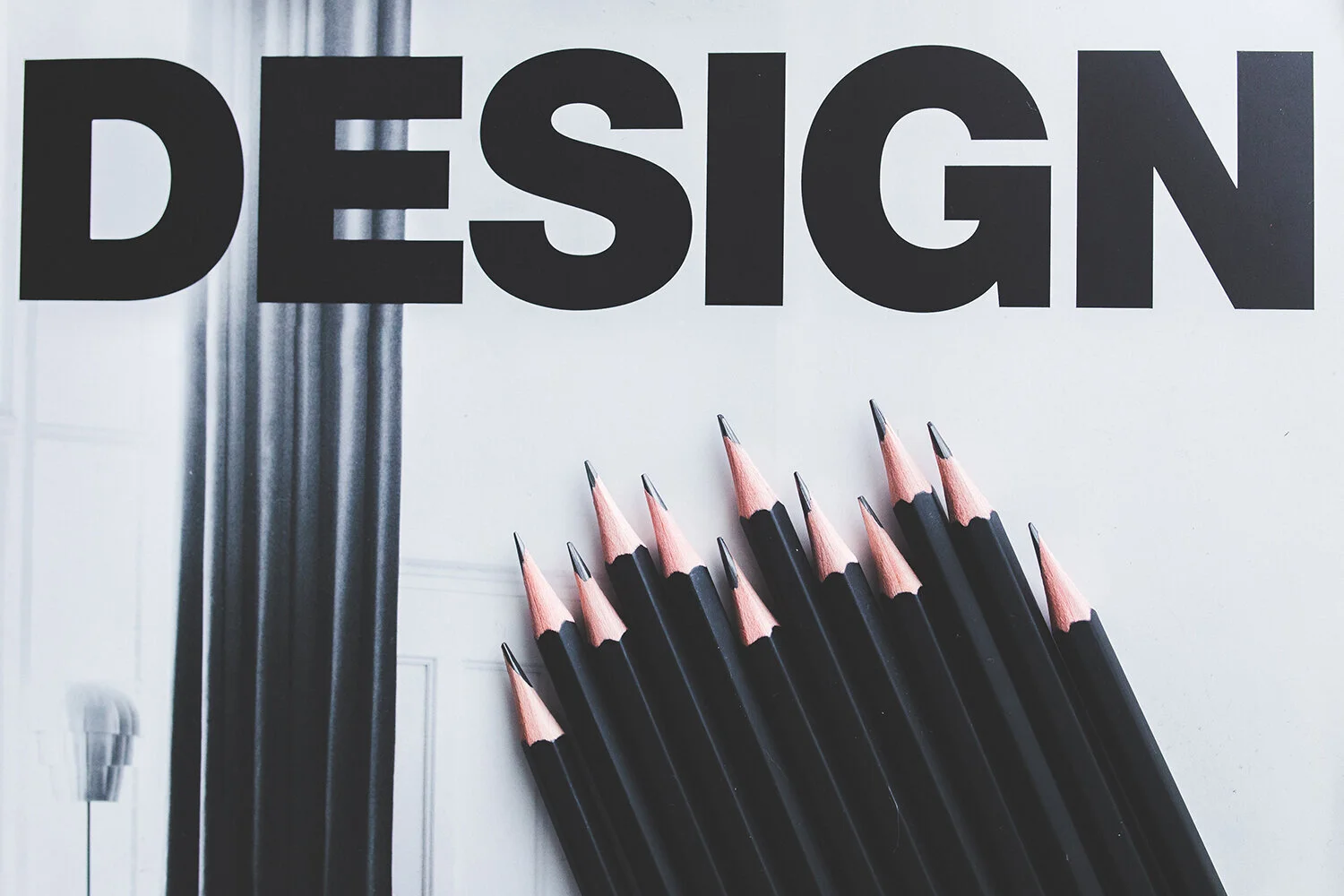
There is a move towards oversized typography on websites. Prominent text on website pages allow brands to communicate even more clearly to their target audiences.
The key for this trend is to keep it simple in order to make the most important information come across for your audiences. Take this example from a real estate company based in the Netherlands. Key text from their brand messaging stands out. And here’s how Heatherwick Studio interprets the trend on their website headings.
Website design trends – hit or miss?
So there we have it. A round up of the website trends that we’re likely to see more and more of in the coming months. Have these website design trends got you thinking? Which are your favourites?
As communication specialists in the built environment, naturally we’re drawn to the first two trends; visually-led websites and engagaing use of website graphics. These are the trends that we believe are important in the telling of your brand story, especially within the image-focused field of the built environment. Good use of these particular trends will help set your brand apart from any competition.
Why not get in touch with us for an initial brand consultation where we can incorporate some of the above trends in your digital strategy? And for more marketing and communications-related content don’t forget to follow us on our socials on LinkedIn , Twitter and Instagram.


